JCS Website: A Web Design Case Study
Project Overview
JCS, a renowned organization, entrusted us with the task of designing their website. Our goal was to create a platform that not only showcased JCS’s mission and projects but also provided a foundation for growth and fundraising.
Design Process
1. Color Scheme
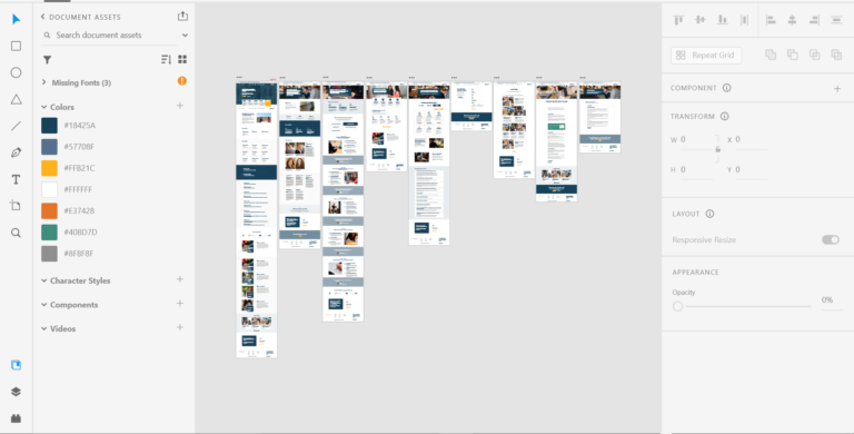
The color scheme was chosen to reflect the ethos of JCS. We used a palette that resonated with their brand identity, creating a visually appealing and consistent user experience.
2. User Interface (UI) and User Experience (UX)
We designed an intuitive UI to ensure that visitors could easily navigate the site and find the information they were looking for. The UX was designed to be engaging and interactive, encouraging users to explore the various projects and initiatives of JCS.
Features
1. Donations Page
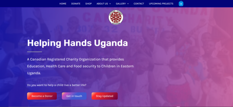
One of the key features of the website is the donations page. This allows visitors to contribute directly to JCS, providing a source of income and contributing to the sustainability of the organization’s projects.
2. Growth Tools
We integrated various tools into the website to facilitate the growth of JCS. These include SEO optimization, social media integration, and a blog platform for sharing updates and engaging with the community.
Benefits to JCS
The JCS website has been instrumental in raising awareness about their mission and projects. It has also been a valuable tool for fundraising and has contributed to the growth of the organization. The donations page, in particular, has made it easy for supporters to contribute, increasing the organization’s funding and enabling it to expand its projects.


